Ever wondered how a website effortlessly grabs your attention and guides you to click? That’s the power
of a perfect call-to-action (CTA).
To lead visitors to your website’s conversion points, mastering CTA best practices is crucial.
Optimising your CTAs turns casual browsers into dedicated customers or valuable leads.
Curious about how to design a CTA that stands out and motivates action? Join us as we delve into the
world of CTAs, where every click counts and every detail is vital.
What is a call-to-action button?
A "Call to Action" (CTA) button is a crucial element in digital marketing, web design, and user
experience. It's a button or link on a webpage, email, or advertisement that prompts users to take a
specific action. The goal of a CTA button is to guide
users towards completing a desired action that benefits the business or website.
CTAs (Calls to Action) help users know what to do next, like downloading a file, signing up for
something, booking a demo, contacting support, adding items to a cart, or making a purchase. They should
be easy to use on both desktop and mobile devices.
Effective CTA buttons typically have a clear, compelling message and are designed to stand out visually
on the page. They are often strategically placed where users are most likely to see and act on them,
like at the end of a product description or within
a prominent banner.
Why is a CTA button so important? A well-designed CTA button can turn your website from a static page
into an engaging, interactive experience. Given that most people have an attention span of just eight
seconds, a strong CTA is your best chance to convert
a casual visitor into an active participant.
Ultimately, a CTA button guides users further into your marketing funnel.
No matter if you're designing websites for manufacturers, retailers, or tech companies, having a clear
and compelling call-to-action is essential for driving business. Your main goal is to direct visitors
toward engaging actions, such as requesting a
quote or exploring product demos.
Without a clear CTA, visitors have to search for what they need, which can be frustrating. They might
give up and turn to a competitor if it’s not easy to find.
Seven CTA Best Practices for a User-Friendly Experience
Having discussed why CTAs are essential, let’s dive into best practices that can transform these simple
buttons into powerful tools for your website.
1. Make the Button Stand Out
For a CTA button to be effective, it must catch visitors’ eyes right away. This can be achieved by
focusing on its size and placement.
The button should be big enough to stand out without overwhelming other content or looking out of
place. Positioning it in a central or prominent location helps draw attention. Many websites place
their CTAs "above the fold," a term from newspapers that
now means the part of the page visible without scrolling.
Consider the flow of user experience and reading as well. The button should clearly signal that it’s
clickable, be inviting and easy to understand, and be placed where users naturally expect to find
it. Here are some effective placement options with high
conversion potential:
-
At the top of the page or within the menu
In the middle or at the end of blog posts
At the bottom of the page or in the footer menu
2. Keep It Subtle
Having too many CTAs on a page can overwhelm and confuse users, leading to none of them being
clicked. It’s crucial to find the right balance to ensure a user-friendly experience.
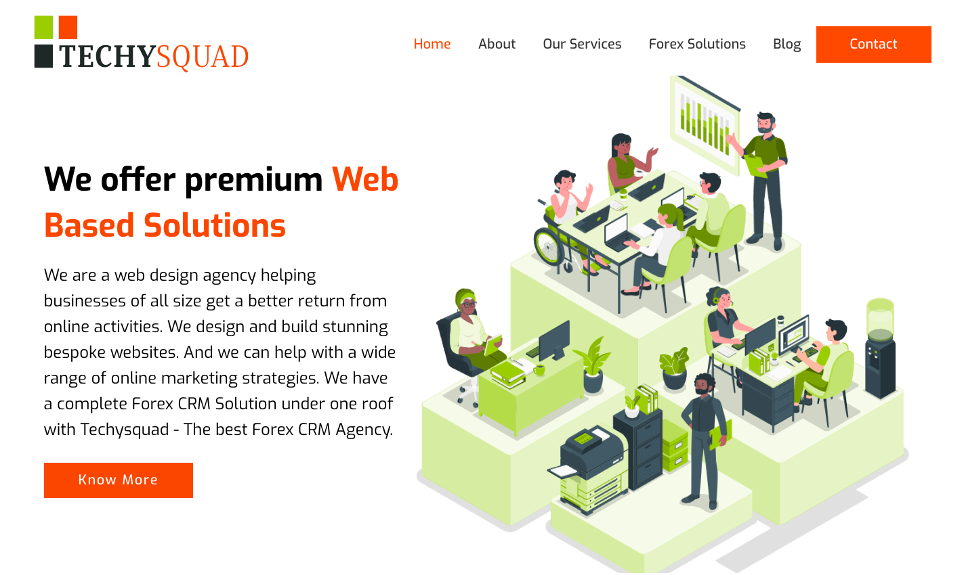
Techysquad effectively uses two CTAs that are both visible without making the page look
cluttered. Their size, placement, and colour are carefully chosen to blend harmoniously.
These two CTAs improve the user experience by meeting different needs: one facilitates contact,
while the other provides additional information.
3. Create a Feeling of Urgency
Have you ever felt a rush to grab something before it’s gone? That’s the power of urgency, a valuable
tool for your CTAs. This feeling, often called the FOMO effect (fear of missing out), leverages our
concern about missing a great opportunity.
By creating a sense of urgency, you encourage users to act now instead of later. But how do you weave
urgency into a CTA without sounding pushy? The answer lies in focusing on choosing the right words and
context.
Effective CTA phrases that convey urgency include “Now,” “Last Chance,” “Limited Availability,” and
“Today.” These phrases create a psychological prompt, suggesting users might miss out if they don’t act
quickly.
Nike’s Urgent CTA for Limited-Edition Sneakers
Nike effectively uses urgency in its CTAs to drive sales for limited-edition releases. A prominent
example is:
"Hurry – Limited Stock, Buy Today!"
Nike often employs this kind of CTA for exclusive sneaker drops or special promotions. The phrase
"Limited Stock" creates a sense of scarcity, prompting customers to act quickly to secure their
purchase. By combining this urgency with a clear call to
action, Nike effectively encourages immediate buying decisions and capitalises on the fear of missing
out.
However, be cautious not to overuse urgency. If your CTA is surrounded by too many urgency-driven
phrases, it might come across as pushy, potentially turning users away rather than encouraging clicks.
5. Choose Words that Inspire
Action
The right wording on your CTA can transform a hesitant visitor into a customer. But what makes a phrase
truly effective?
First and foremost, your CTA must clearly specify the action you want the user to take. It should be
both compelling and straightforward, eliminating any uncertainty about what will happen when the button
is clicked. Additionally, ensure that the copy
is descriptive enough to be accessible, avoiding any vague language.
Begin by choosing strong action verbs. Words like "Discover," "Start," "Get," and "Join" are direct and
impactful.
If you're not a copywriter, crafting the perfect CTA button text can be challenging. However, you can
use technology, such as generative AI platforms, to help generate ideas. Simply input the criteria you
need for your CTA button, and the platform will
provide suggestions. You can also use the platform to create the supporting site copy for your CTA.
6.Use Clear and Informative Alt
Text
Many site owners don’t realise that CTA buttons are categorised with images on a webpage. Just like any
other image, each CTA button should include alt text.
Alt text, or alternative text, is the descriptive copy shown if an image fails to load and is read aloud
by screen readers for users with visual impairments. Adding alt text to your CTA buttons ensures your
website is accessible to everyone. A person
with a visual impairment cannot convert if they can't locate the button.
When creating alt text, be clear and descriptive. Phrases like “Click Here” provide no information about
the button's function, whereas “Sign Up for Our Newsletter” or “Download Our Free eBook” are
informative. Your goal with alt text is to ensure users
understand the action they’re taking, even if they can’t see the CTA button. You won’t get there if you
stick with fuzzy phrases for your alt text.
Creating effective alt text is a simple process once you determine the specific purpose of your CTA.
Imagine you’re managing an online fashion store. If your CTA button prompts users to explore trending
products, you could use alt text such as “Discover the Latest Makeup Trends.” On the other hand, if the
CTA aims to encourage visitors to sign up for
updates, you might use alt text like “Sign Up for Our Monthly Emails.”
Start by altering one element at a time. For example, test two different button colours or two different
phrases, but avoid making two changes simultaneously. This approach ensures that you can pinpoint which
specific change led to improved results. Additionally,
keep all other aspects of your page consistent to ensure that any variation in user response is
attributable solely to the CTA change.
Measure success using metrics such as click-through rates, conversions, or any other indicators that
best align with your objectives.
Testing is an ongoing process. As user preferences and behaviours change, your CTAs should evolve
accordingly. Regular testing helps ensure that your CTAs stay effective and continue to engage your
target audience. By relying on real data rather than
guesswork, you can make informed decisions that lead to a more successful and user-centred website.
Conclusion
Your CTA is a crucial element of your site. Whether you're building a website from scratch or
redesigning it to boost conversions, applying these proven CTA best practices can drive significant
results. They provide a roadmap for transforming underperforming
sites into engaging, user-friendly platforms.
Creating an effective CTA involves understanding psychology, design principles, and your audience's
preferences and goals. Through continuous testing, learning, and adaptation, you can elevate your
business to new levels of digital success.
Cheers to CTAs that not only attract attention but
also drive exceptional results.

